Home > Posts > New Contour dashboard with hyper-localised widgets
27 February, 2019
New Contour dashboard with hyper-localised widgets
New Contour dashboard with hyper localised widgets
27
FEBRUARY, 2019
Global Release Note
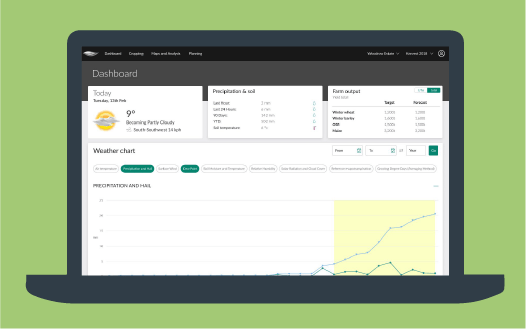
Last week, Contour released a fresh look and feel with a new user experience to its digital agronomy tool. This new release brings a new dashboard, which includes simple display boxes for information at the top of the dashboard (known as ‘widgets’). The innovative dashboard provides users with specific information for farmers and agronomists to make better data driven decisions.
Improved Dashboard:
Quick, easy to read information about your farm
The new dashboard layout highlights historical rain records, current soil temperature, forecasted weather, and the yield prediction for harvest. To see your hyper- localised dashboard, follow thelink.
The new ‘widgets’, at the top of the dashboard, provide at a glance information on the current weather, a precipitation and soil display which provides metrics on soil temperature and rainfall, and a new ‘farm output’ widget, which – when cropping and drill dates are entered – shows the aggregated yield forecast for the farm by cropping.
Weather condition icons for historical satellite images
Further improvements have been made to the new sliding timeline navigation bar on the maps and analysis page, giving users easy access to historic satellite images. The new icons signify the status of the satellite image that was acquired on that day
the sun icon represents a clear farm image, where a good farm image was available across the whole farm;
the partly cloudy icon view displays where images are available across some of the farm, field or management zones;
the cloud icon shows those days where a satellite image was obtained but, on review, was obscured by cloud, haze, or other conditions (such as snow) made the image unusable for decision making and is not presented in the system.
 the sun icon represents a clear farm image, where a good farm image was available across the whole farm;
 the partly cloudy icon view displays where images are available across some of the farm, field or management zones;
 the cloud icon shows those days where a satellite image was obtained but, on review, was obscured by cloud, haze, or other conditions (such as snow) made the image unusable for decision making and is not presented in the system.